In a recent post, I argued that the Bernanke and Yellen Fed’s have been striving for a ‘no tea leaves’ approach to policy communications. An astute JHU student responded, ‘How about those dots?’ Good students can be annoying that way.
There is a sound reason for publishing the dot plot, but we should not expect these ‘if you were Czar’ policy paths to be of much value in clarifying policy intentions of the FOMC.
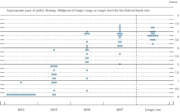
At the outset, let me remove some suspense by sharing what Wednesday’s new dot plot will clarify about the likely path of policy: nothing.
What is the dot plot? The FOMC publishes a Survey of Economic Projections (SEP) quarterly, giving the 19 FOMC participants’ projections for real activity and inflation.[1] Along with these projections, each participant submits his/her view of where the federal funds rate will be at the end of the current year and end of the next couple years. These year-end rates for the participants are then turned into the dot plot—the October plot is below.
The latest version of this dot plot will be released by the FOMC at the end of its meeting on Wednesday. Immediately after, analysts will carefully scrutinize it for evidence of when the Fed will raise the policy interest rate and how quickly rates will subsequently rise. The new dot plot will also give rise to another edition of ‘name that dot’ in which Fed watchers attempt to figure out which policymaker is responsible for which dots—for example, the Chair’s dots are viewed to be particularly interesting, and analysts also try to take account of the fact that more than 40 percent of the dots at present are submitted by people who do not participate in the policy vote.[2]
Why do I say that the dots will clarify little about the likely path of policy? One could support this claim merely based on earlier experience. Wednesday’s release completes the third year of dot plots, and a review of the experience so far provides many times when the plot has confused and obscured;[3] it is harder to find a time when it clearly facilitated the understanding of policy.
This checkered history should not surprise anyone who recognizes that the dots do not represent the participants’ views of the likely course of policy. Rather, they effectively represent an answer to the question, ‘If you alone were policy Czar, what policy do you project that you would implement?’
To understand why the FOMC publishes these ‘if you were Czar’ policy paths, we need to understand what the SEP projections are. The projections in the SEP represent the personal views of each of the 19 FOMC participants. Any projection of real activity and inflation will depend on what the person doing the projecting believes will happen to policy during the projection period. It might seem most natural for the policymakers to base their projections on their own best guess of what policy the FOMC will implement—this is what private-sector forecasters do. But this approach creates a tension arising from the fact that each policymaker would effectively have to forecast what the group will do. To see the tension, take an FOMC member who plans to fervently argue for, say, a higher path for the federal funds rate than the committee is likely to adopt. Should this person project his/her own realistic view that this position is unlikely to carry the day? Could this person be as credible in the deliberations having already predicted a failure to persuade? Or should the person simply project the tighter policy despite his/her realistic knowledge that this policy path is unlikely to prevail?
It is in part to avoid such difficulties, that each SEP projection is conditioned on the individual’s own view of appropriate policy—even if that differs from what the FOMC is likely to implement.[4]
While this approach arguably makes good sense given the committee structure, the resulting dots need not give a clear sense of where policy will go. The SEP mainly provides information about the diversity of views among the 19 policymakers who participate in FOMC discussions; it sheds little light on how those views coalesce into a policy choice. As we are all aware, there are significant differences in society at large and among experts regarding the appropriate course of policy in these unprecedented times. This is reflected in the broad spread of the dots illustrated above. The SEP essentially affirms for the public that the diverse views in society are also present as inputs to FOMC deliberations.[5]
In my view, the dot plot is a bit like the ingredient list on canned chili: it is important that the information be provided, but nobody should expect that the ingredient list will reveal much about which chili tastes best.
In the case of monetary policy, there is a good reason why the ingredient list is particularly uninformative. The dots give every participant’s favorite policy. Suppose we asked the participants a different question: ‘What range of policy statements[6] would be broadly acceptable to you today, especially in light of the fact that you will meet to revise the policy every six weeks?’ This range may be quite large. If we could take the overlap of FOMC members’ views of acceptable policy, we could probably be pretty confident that the policy statement would come from somewhere within this range. The particular policy selected from among this group, however, will naturally depend on leadership of the chair, persuasion, strength of views, risk management considerations, and so forth. Mechanical aggregations of the ‘if you were Czar’ paths need not be very revealing.
Imagine instead that the FOMC were choosing what color to paint the board room. In order to facilitate transparency about this important decision, each FOMC member is asked, ‘if you were color Czar, what color would you use?’ Even if we were to publish the resulting rainbow of 19 colors, it would probably reveal very little about what color would ultimately be chosen. Once again, the range of colors that everyone would find acceptable is probably rather broad, and within that range, the choice would likely to be determined by leadership, strength of views, etc. (In this case, my detailed knowledge of the FOMC leads me to imagine that something close to taupe[7] would prevail, even if the hawks leaned toward red and the doves, baby blue.)
There is a sound reason for publishing the dot plot, but we should not expect these ‘if you were Czar’ policy paths to be of much value in clarifying policy intentions of the FOMC.
Footnotes
1.Seven governors and 12 regional Fed presidents when fully staffed. [back]
2.Five of the 12 presidents vote on a rotating basis. At present with 2 governor positions unfilled, 7 of 17 respondents are not voting. [back]
3.A review of the press conference transcripts supports this claim. For example, from the April 2012 press conference:
STEVE LIESMAN. Mr. Chairman, according to the latest forecast, 10 members of the FOMC see a 1 percent or higher fed funds rate in 2014; 7 of them see a 2 percent or higher fed funds rate. Under that—those conditions, how can the guidance in the statement, that you remain exceptionally low through late 2014, be justified? And is there a point at which the dissonance between the individual forecasts and the guidance get to a point where one or the other is no longer tenable?
Or from March 2014:
JON HILSENRATH. Jon Hilsenrath from the Wall Street Journal. Chair Yellen, in the interest rate projections made by FOMC participants that supplement your statement, there seems to be a slight upward drift in the expectations for rates going out to 2016. For instance, a majority of officials see rates at 1 percent or higher in this forecast round. In the last forecast round, a majority saw officials less than 1 percent. I wonder if you could explain why there is this small upward drift in expected rates among Committee members, whether these projections are a good guide for the public about where rates—about the path of rates going forward, and also how you reconcile this upward drift with the assurances that the Committee makes in its statement that rates will stay below normal levels well into the future.
In each of these cases, the Chair at the time responded, essentially, that policy is the result of a committee decision and need not be reflected in any simple way in the dots. [back]
4.Up until January 2012, the projections were conditioned on these ‘if you were Czar’ policies, but the published SEP did not reveal what policies gave rise to the real activity and inflation projections. This is problematic because understanding policy is an important part of making sense of the projections. In my view, so long as the published projections are conditioned on ‘if you were Czar’ policies, then also publishing the presumed policies is almost essential to understanding the projections. [back]
5.At present, the key part of the policy statement is the forward guidance—the characterization of the likely path of policy going forward. [back]
6.The overall constellation of dots probably conveys some sense of the range of possibilities. When the dots generally shift in one direction, the shift may, but may not (as the second example in footnote 3 illustrates), say something about a general shift in views. Any shift in views will probably be conveyed more clearly in the FOMC statement, press conference statement and other communications. [back]
7.Taupe, as you know, is generally accepted as the most somber of the beige tones. [back]