By Floyd Norris
“We should spend less time talking about race and more time talking about how to get people to work.”
Sen. Josh Hawley, R-Missouri, reacting to Donald Trump’s statements on Kamala Harris’s heritage.
The Democrats think jobs should be their issue this year. The flood of new jobs created during the Biden administration dwarfs those under previous presidents.
But to Republicans, we have a poor job market that needs to get better, as Hawley said this week.
Does he have a point?
By one indicator, it would seem he does. The Labor Department computes the “Employment to Population Ratio,” or EMPR to data nerds. That uses data from the Household Survey – not the survey of employers that produces the monthly report of job changes. That survey has not been as strong recently.
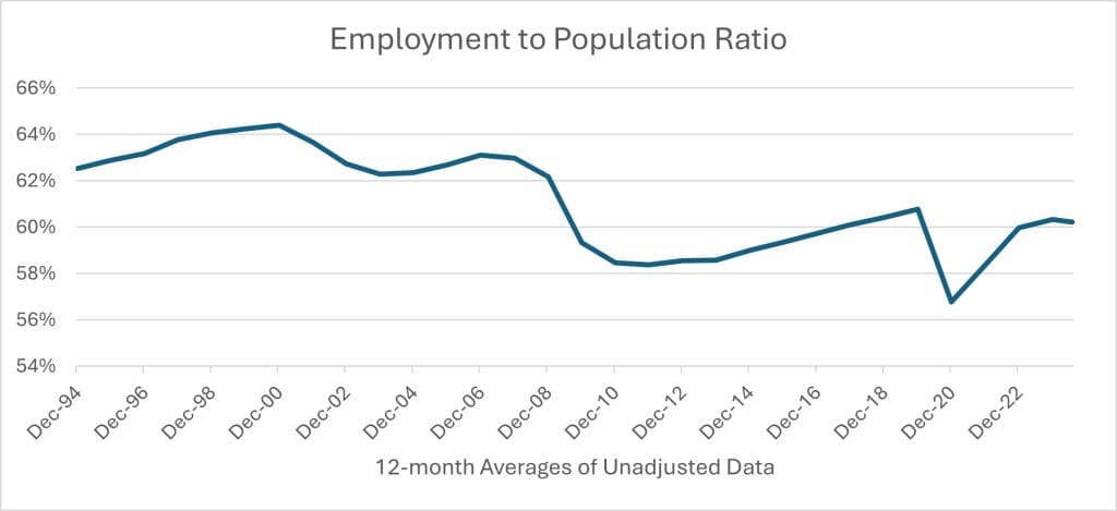
Here is what the EMPR looks like now. For reasons that will become clear, we are using non-seasonally adjusted data, but then averaging rolling 12-month periods:

By Labor Department calculations, the proportion of people of working age with jobs has risen since the Pandemic lows, but remains lower than before the Pandemic hit. Moreover, the current level is well below where it was before the 2008 financial crisis. It appears the job market never completely recovered from that crisis.
But is that a reasonable way to look at the data? The Labor Department counts everyone over 16 years of age as being in the working age population, whether they are 16 or 100. We all know that the population is older now, and that people are less likely to hold jobs after they reach retirement age than they were in their Thirties or Forties.
Since 1994, the Labor Department has calculated separate figures for every age group of men and women, ranging from teenagers to senior citizens over 75. Those figures are not seasonally adjusted, and some jobs are seasonal – school teachers, for example – so we use 12-month averages of the unadjusted data.
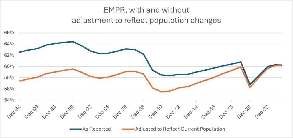
To get an apples-to-apples comparison of the data, the following chart uses the actual reported EMPRs for each group, but then recalculates them assuming that each age group worked as it actually did, but with the total calculated as if the population had always been as old as it has been over the past year.

Sources: Bureau of Labor Statistics, author’s calculations
The picture is very different. With population adjustments, it appears that people were more likely to be employed in 2024 than at any previous time. That supports the Democratic assertion.
What caused the difference?
It wasn’t due to young people. Fewer men and women under 25 are working than in the past. More are in school, and fewer of those in school appear to have summer or after-school jobs. But older people, particularly women, are more likely to be working.
The proportion of women holding jobs rose steadily for most of the second half of the Twentieth Century, but peaked around the turn of the century and began to dip. Those figures have revived. There are more women in almost every age group from 25 to 49 who are working. The proportion of women in their 50s fell off during the Pandemic, and has not completely recovered. Presumably fear of Covid, which was more dangerous to older people, led to some retirements.
But women in their 60s and 70s are more likely than before to be employed, although of course the proportion with jobs falls as people age.
Among men, there was a long-term decline in the proportion of people working throughout most of the second half of the last century. But that stalled, and, in some age groups, has reversed.
Older men, like older women, seem to be retiring later than their predecessors. All groups of men over 50 are more likely to working than their predecessors 17 years ago, although some are a bit lower than they were a year ago.
If we compare the EMPR figures for the 12 months through July, as reported Friday by the Labor Department, with the figures for the 12 months through July 2007 – just before the financial crisis hit — we get the following table, showing the current EMPR for each group, and the change, in percentage points, since 2007.
| MEN | Current | Change | WOMEN | Current | Change | |
| Total | 65.9% | -4.9% | Total | 55.0% | -1.6% | |
| 16-9 | 37.3% | -4.4% | 16-9 | 38.4% | -4.5% | |
| 20-4 | 70.2% | -5.8% | 20-4 | 66.3% | 0.2% | |
| 25-9 | 84.1% | -3.8% | 25-9 | 71.8% | 0.6% | |
| 30-4 | 88.3% | -2.3% | 30-4 | 74.5% | 5.2% | |
| 35-9 | 88.6% | -1.4% | 35-9 | 74.7% | 5.0% | |
| 40-4 | 88.0% | 0.0% | 40-4 | 75.1% | 2.2% | |
| 45-9 | 87.0% | 0.4% | 45-9 | 75.5% | 1.8% | |
| 50-4 | 84.6% | 1.3% | 50-4 | 73.8% | 2.2% | |
| 55-9 | 75.7% | 0.2% | 55-9 | 65.2% | 1.1% | |
| 60-4 | 62.3% | 4.7% | 60-4 | 50.5% | 4.3% | |
| 65-9 | 36.5% | 3.5% | 65-9 | 27.9% | 3.5% | |
| 70-4 | 22.2% | 2.1% | 70-4 | 15.8% | 2.2% | |
| >75 | 11.0% | 1.3% | >75 | 6.4% | 1.8% |
The figures for women are the most startling. Every age group, except for teenagers, has a greater proportion of women working now than 17 years ago. But overall, because of the aging population, the figures show a lower proportion of women with jobs.
Among men, all age groups over 45 now have a greater percentage of people with jobs. Those groups under 40 are not as high. But the overall decline, of 4.9%, is larger than that of any group except for 20-24 year olds.
The aging of the current population will continue for years to come. By the end of this year, baby boomers will be at least 60, and as old as 78. Even if the trend of fewer births in this country were to reverse overnight – something no one expects – that would not begin to affect the working age population until 2040.
To get more people of actual working age – primarily those from 20 to 65 – who will hold jobs and pay Social Security taxes – the only possible route is to increase immigration.
Politically, however, that is not an especially popular idea at the moment.